


Microsoft redesigns the Office environment icons
After five years without new redesigns, Microsoft has already revealed how the new icons of the Office 365 application are. The new designs have more intense and clear tones. These are accompanied by minimalist images and symbols that, as they claim, are recognized instantly.
Created by Microsoft Design, the internal design team, each icon has been created looking for the most minimalist forms, but without losing the most representative and well-known elements by the users. In this way, the new Microsoft Office icons retain the initials and colors of the programs they represent.
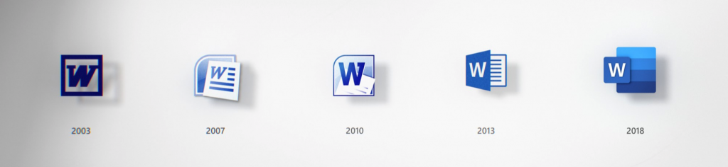
The solution they have found through the design has been to separate the letter and symbol in the icon by creating two layers (or panels); one for the letter and another for the symbol that can join or separate as appropriate: “This allows us to maintain familiarity while emphasizing simplicity within the application. The separation of these into two panels also provides depth, which generates opportunities in 3D contexts. Through this flexible system, we keep the tradition alive. ”
Office applications work together, allowing users to open PowerPoint or Excel next to conversations in Teams or in Outlook. To reflect this in the icons, they eliminated the visual limit; the traditional format of the tool: «While the previous icons of Office had a schematic drawing of a document for Microsoft Word and a schematic drawing of an Excel spreadsheet, now we show lines of text for Word and individual cells for Excel. By focusing on the content instead of any specific format, these icons embody the collaborative nature of the applications they represent. ”
In the same way, they have changed the relationship of the letter with the symbol. Traditionally, the letter occupied two thirds of the icon, and the symbol occupied a third. Now they have changed this proportion to emphasize the symbol, since, “if the letter represents the tool itself, the symbol speaks more of the creations of the people”.
SOURCE: www.graffica.info
